Tymtravler
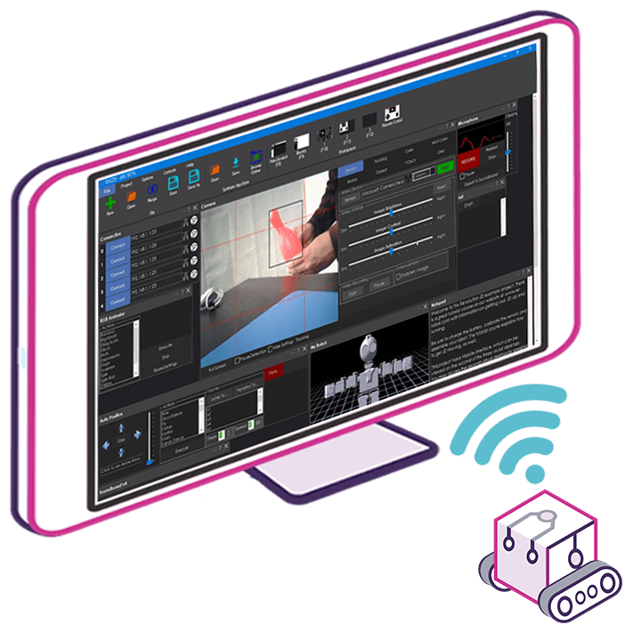
I could not belive how many boxes I have for my robot project. When I look at the screen it's full like 6 servo, 2 h-bridges, the big camera, radar, voice recognition and the list goes on. I really like the auto arrange feature but every time I add a new component they all get switched around. Now my suggestion is since it is a window box for say the servos how hard could it be to put a minimizing button in the upper right hand corner so when we click it the box is reduced and all u see is the header discription of the component. Now u could have multiple component in a small space. Visually u could see all of components without having to scroll all over the place. Then if u wanted to adjust say a servo go to the minimised box click to expand, do your work and then shrink it again. Now it is only a suggestion to an already great produce and I would not want the software team to move there sights from the Kinect's development but I just thought this might be a cool feature.


Take a look at the Basic View vs Advance View feature in ARC under the Projects tab.
It's not perfect but might help do what you want.
I'm with Tym on this one. The Advanced view really doesn't do it for me. A minimize option per control would be awesome. I've removed "redundant" controls from my past projects not because I didn't like them but I wanted to experiment with other controls and not deal with the scrolling. I also am not a fan of Full Screen mode for anything either so even though that provides more area I'd like to just minimize controls I'm not focused on. These are admittedly just my personal preferences.
Don't know if it was there before or if DJ just popped it in but I found the MINIMIZE ALL tab under control. This is just what I wanted. Now I can minimize all the boxes down to little tabs and just open the ones I want. Thanks DJ
Minimize all has been in since I've been using ARC
But as Lumpy suggested, take a look at advanced vs basic modes. What I've done in mine is turned off auto arrange and grouped all controls, setting the ones needed in basic mode to be turned on and the ones I don't need hidden.
My screen is pretty full, at 1080p resolution but I just about fit it all in nicely.
Advanced user tip: Edit the .ezb file in a text editor and position your controls exactly where you want them, in line with others by editing the x/y values I don't suggest altering the file if you don't know what you are doing though, the chances of breaking the project are very high.
Also, you can disable Auto Arrange
Nope I never saw this before but it does exactly what I want.