Asked — Edited

Paint Scheme?

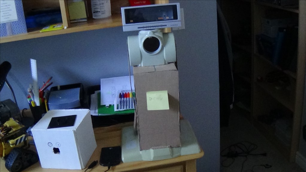
I'm looking into a paint scheme for my project Dewy. His picture is below.

User-inserted image

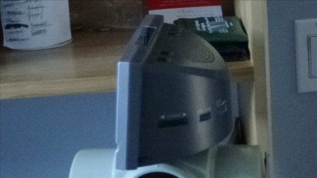
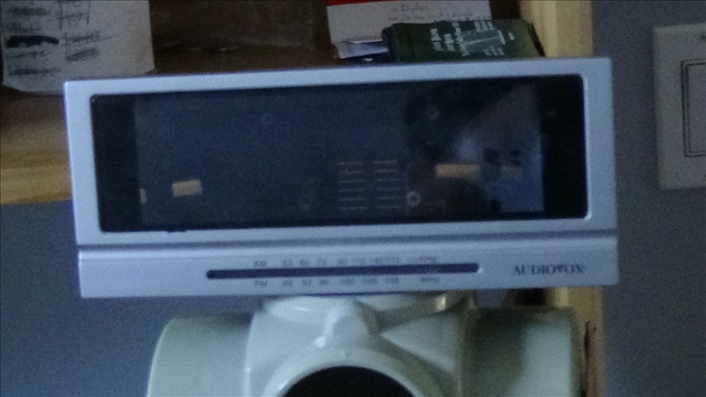
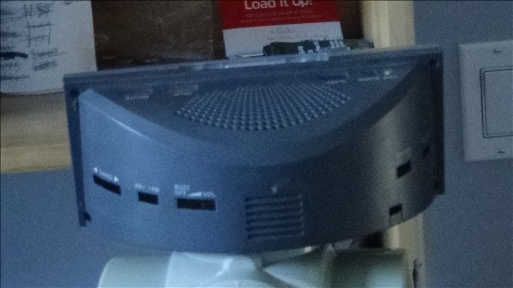
He isn't finished yet but I wanted to start to get an idea. Here's his new head. it needs to be painted too. The display part(clear) will be tinted and will have leds behind it.
User-inserted image

User-inserted image

User-inserted image


ARC Pro

Upgrade to ARC Pro

ARC Pro is your passport to a world of endless possibilities in robot programming, waiting for you to explore.

#3  

I like black and silver. But a red and white bot might be cool.

#4  

Ok maybe like the shoulders silver, the rad body black, the head a combo of black with silver racing stripes, the arms black with a silver decal(arms not yet implemented), the body extension(box) black with a silver fan decal and the ez-robot logo, and the rad base fenders with racing stripes and the rest black.

Picture it and tell me what you think.

PRO
Belgium
#5  

dark grey is my favorit.

#6  

Love the head.... Love the idea of using regular household items or consumer goods as robot parts....

#7  

Bought the head last August. It was an alarm clock. Ripped the insides out and left it 'till now. When I finish the main gist of Dewy I'll post my paint scheme rough sketch.

PRO
Belgium
#9  

what about silver&gold ?:D

#10  

Here's the gist of my paint scheme idea. I used different colours of black to help divide sides. keep in mind that the white parts will be painted black too.

User-inserted image

Yes? No?

PRO
Belgium
#11  

when i use black,i use not chinning black.there is some where a topic off some one painting his car. he use awesome not chinning black.the stripes chould be somehow connecting. but thats just my opinion.

you making very cool robot and you have very cool base. why cover that all up whit black?you will not see all the beuaty.

#12  

I can see your point. true DIY people like showing off what they build in a way that looks DIY. I want to try to make a clean designed robot.

PRO
Belgium
#13  

sorry what means diy? something simpel but goodlooking.

#16  

Yah, don't feel bad. I didn't know what that meant either. We're in the age of texting and that lazy from of shorthand is bleeding over into other forms of communication. I hate it but that's just me. I'm guilty of using it too.

Thanks i feel better now. cool

#19  

Cupcake: Great drawing! How about the black line silver and the white stuff black?

Dave: I agree.

nomad: Don't worry. I wasn't sure what it meant for a while when I started.

#20  

Who noticed the funny head in the bottom of the last picture?

#22  

i tried one more time, did you mean something like this? i tried to make it look more like your original design

User-inserted image

#23  

Dave: Yep........................ blush

Cupcake: Yea actually! Hmmmm... I guess we have to have a vote on which one to do. They're both great!

1.

User-inserted image

2.

User-inserted image

Vote for which one!

South Africa
#24  

I vote for picture number 2

PRO
Belgium
#25  

pic 1 techno all is fine

sorry didn see the pics had number

#26  

#1..... Less is more sometimes...

See we need polls...:)

#27  

You know, I pitched black and silver but I like #1

PRO
Belgium
#29  

dark vs light 3 to 1 how long will the poll last

#30  

I think it's pretty well done! the odds are in favour of #1 and I too like 1 so I think we'll use it! Thanks a lot Cupcake!

Reason for #1: I found it follows the original paint scheme of the rad, which was nice.

User-inserted image

Cupcake, I may modify the design a bit if I find it difficult to do. Also, I thought about adding something to the base fenders.

User-inserted image

One last thing. Any ideas for what to put in the chest hole are welcome.

#33  

I know! the ez-robot symbol!

User-inserted image

Maybe mount it on clear plexi glass and have a light coming from inside the body shining out.

#35  

glad i could help you a bit:D

it's gunna be cool to see this finished, i like the body style