PRO
afcorson
Australia
Requested
ARC Command Ribbon Score 824
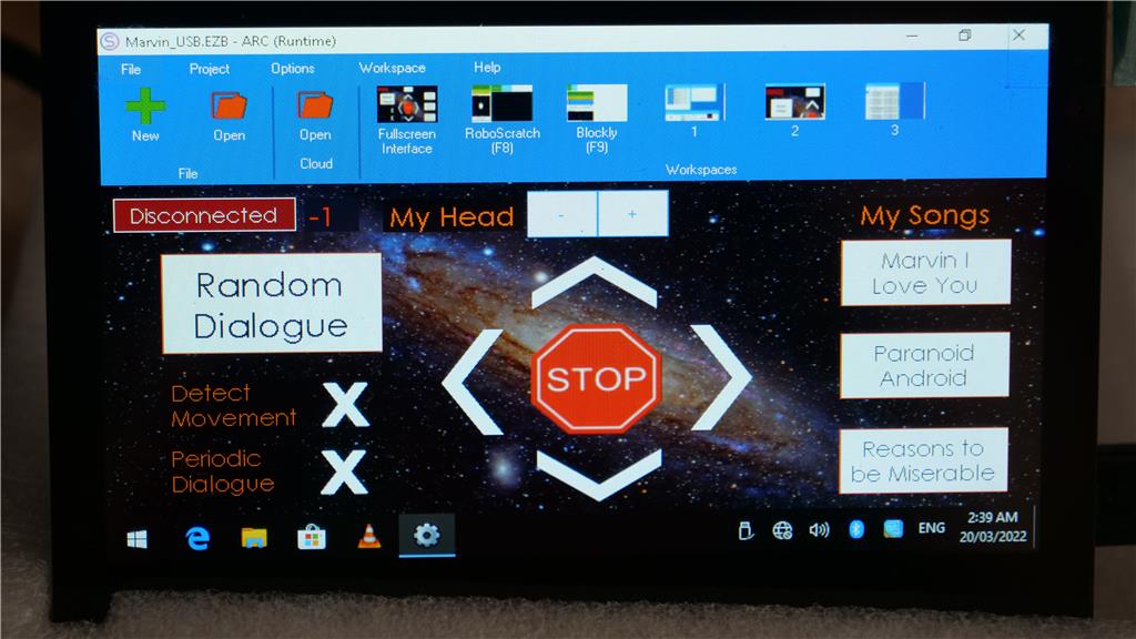
I would like the ability to toggle off and on, the ARC Command Ribbon at the top of the screen. You can see in the image below, it takes up a lot of real estate on a 4.3" touch display. I presume this feature doesn't already exist.
Want to see this feature happen? Like it to increase the score.
Look center left on the "Command Ribbon" you want to toggle off. You will see a button that says "Full Screen Interface". Try clicking on that and you should get rid of the ribbon and your lower taskbar. I cant remember how to get it back up but ARC may show a popup with how to get back to normal view when you toggle it off. Have fun!!!
It is already in full screen interface mode. Even if I go into preferences and check full screen, that only removes the lower taskbar making little difference.
Sorry for the bad advice.
It’s holiday so I took care of this in my spare time. It’ll be in the next update
That's brilliant. Happy holidays.
Okay, it's ready for release soon. I think a few more things are getting worked on, so the release should be in the next week or so. It's a year-end update, so I believe there are more changes than usual.
It'll be in the next release - apologies for the delay . Now when you view the full screen, just press the X to close full screen
I have checked this feature in the new release. I get a white ribbon at the bottom of the screen when in full screen mode. Is there some setting to remove this? Also there is no toggle button to make the old top ribbon appear and disappear - not that it matters to me but it would mean every user has to resize their mobile interface for full screen mode.
It seems there's a silly bug with that strip for some reason - it's logged for a deeper dive to find out why
In the meantime, what do you mean by...
Because the entire screen is full, whether there is a menu bar or not, the bar disappears until you press the X, bringing you back to the edit mode. No changes are needed by the user for past or future projects. The full-screen remote control view merely removes the menu bar, as you requested - it doesn't require the user to do anything different
If you use a background image on your Mobile Interface, the aspect changes. For example, I might use an image 800x480px that looked correct in full screen mode before the ribbon modification. Remove the ribbon, and the 800x480px image now looks distorted in full screen mode. I have to resize my background image to something like 800x600px to get the same look. Not just the image, but the shape of buttons can also change. In the screenshot of the JD humanoid mobile interface screenshot above, I can see the distortion in the joysticks. They are no longer circular. I guess it depends on whether or not you design your mobile interface to look correct in full screen mode. I always do.
Ah, yes, I see - thank you for the clarification. I thought the background should be calculated for the new resolution, but I'll have to do some tests. I know the ez-robot JD project has a background dependent on the aspect because it puts the buttons in the background. Thanks, I'll check on that!
Thanks. I am happy to resize my mobile interfaces, just need to get rid of that white space at the bottom and all will be good.
I am wondering if this modification can be reversed or tinkered with. It is driving me crazy with 3 versions of my interface being presented in the same project. If you look at the image below, when I open my project, the interface has this white strip at the bottom. If I collapse the window and restore, the white strip disappears. However, the buttons are out of alignment. The third image shows what the interface should look like.
Thanks for fixing this. The mobile interface size is now consistent.